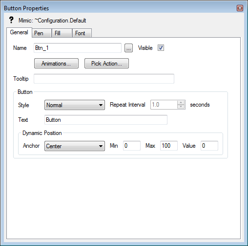
When you have added a button to a Mimic, you can access its Button Properties window to edit its settings. To display the window, double-click on the object on the Mimic. (For other ways of displaying the window, see Display the Properties Window for an Object on a Mimic.)

The Button Properties window has four tabs:
- General—The General tab contains some common settings for General tabs, including Name, Visible, Animations, Pick Action, ToolTip, and the Dynamic Position settings. For more information on these settings, see General Tab.
The General tab on the Button Properties window also contains these settings:
- Style—Use the Style combo box to define whether the button is:
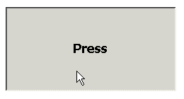
- Normal—The button will appear to be pressed down when it is selected (the button will only appear to be pressed down when the Mimic is in Run mode).

When a normal button is pressed, it executes any animations or pick actions associated with the button once per selection. For example, if a button is configured to change the state of a digital point, pressing the button so that it is pressed down then deselected 3 times will change the state of the point 3 times. Holding the button down will only change the point state 1 time.
- Latch—The button will only appear to be pressed down when its Latched animations property has a value that is true.
Typically, the Latch style is used with a button that is animated to perform an action when selected. For example, a button can be configured to change the value of a digital point to True when it is pressed. The state of the digital point can also be associated with the button's Latched property so that when the button is pressed, the digital point's value changes to True and the Latched property changes to True. So, when the button is selected, there is a short pause as the values and states are processed and changed, then the button appears to be pressed down.
For more information, see Latched.
- Latch w/feedback—The Latch w/feedback style works in the same way as the Latch style except that there is no delay when the button is selected—the button appears to be pressed down when it is selected and when its Latched property has a True value.
For more information, see Latched.
- Repeat—The button appears as a ‘normal’ button, but when held in the pressed down position, it continues to execute any associated pick actions or animations. For example, you can configure a repeat button so that, when selected, it executes a Logic program. If you keep the repeat button pressed down for 30 seconds, the associated Logic program will execute 30 times (once per second by default).
The Repeat button is designed to be used with pick action animations, where a method is called repeatedly for as long as the button is pressed down. For more information on the Repeat feature and an example of how it can be used, see Using Repeat Buttons to Write to a Point.
Momentary—When a user presses a Momentary button, ClearSCADA will activate an associated pick action. When a user subsequently releases the button, it will activate a different pick action (or deactivate the original pick action).
The Momentary button works in a different way to other ClearSCADA buttons. Once a user presses the Momentary button, both the press button action (Button Down) and the release button action (Button Up) will take place, whatever the user subsequently does. For example, a user may move their mouse cursor away from the button after the Button Down action. The user may then assume that the Button Up action will not take place. This is not the case. The Button Up action will still take place once the user releases the mouse button.
There are important exceptions to this. If a communications outage or a server changeover occurs immediately after the Button Down action, the Button Up action may not take place. The Button Down action would then continue.
You can configure the Button Down and Button Up pick actions separately. To do this, use the Pick Action Wizard. For more information, see Accessing the Pick Action Configuration Wizard and see Associating Mimic Objects with Pick Actions.
The available pick actions are Method, Script and Registry.
Do not configure pick actions that involve long-running scripts. This is because a script that is triggered by the Button Up action may terminate a still-running script triggered by the Button Down action.
Do not configure a Button Down action that displays a dialog or other display. This is because any displays triggered by the Button Up action may not replace those triggered by the Button Down action.
 CAUTION
POTENTIAL FOR EQUIPMENT DAMAGE
We recommend the following:- You should only consider using a Momentary button if you cannot achieve what you want to do with a Repeat button.
- You should only use a Momentary button if you have reliable communications. If you have intermittent outages you must not use a Momentary button.
- Ensure that you have sufficient safety processes in place to protect against the Button Down action continuing in the case of a communications outage, server changeover or other cause.
- Use a Momentary button for low-risk actions only.
- Do not configure actions that involve long-running scripts or that display dialogs or other displays.
Failure to follow these instructions can result in equipment damage.
- Normal—The button will appear to be pressed down when it is selected (the button will only appear to be pressed down when the Mimic is in Run mode).
- Repeat Interval—Only available when the Repeat option is selected for the Style setting. The Repeat Interval allows you to define how often the repeat occurs. By default, the Repeat Interval is 1.0 seconds which means that if the button is held in a pressed down position, the action for the button will repeat once per second (for as long as the button is pressed down). You can change the amount of time between each repeat as required.
- Text—Enter the text that will be shown on the face of the button. By default, the Text entry is 'Button'.
The Text entry will be overridden by any animations that use the Text animation property of the button. For more information,see Animations.
- Style—Use the Style combo box to define whether the button is:
- Pen—Use the Pen tab to define the color and shading settings for the text that is shown on the button. The Pen tab settings work in the same way as the settings on other Pen tabs (see Pen Tab).
- Fill—Use the Fill tab to define the color and shading settings for the background of the button. The Fill tab settings work in the same way as the settings on other Fill tabs (see Fill Tab).
- Font—Use the Font tab settings to define the style, size, and positioning of the text that is shown on the button. The Font tab settings work in the same way as the settings on other Font tabs (see Font Tab).